With the high-street an absolute no-go at the moment, your online presence is more important than ever before.
But it's easy to let issues pile up on your site that, over time, become harder to spot with an untrained eye.
Here at 22 Group, we're website experts and we can pinpoint the key areas where your website is falling short.
So, what things should I be looking for when optimizing my website? We’ve done the hard work for you...
Too many calls to action
A messy homepage, with too many calls to action, will confuse the eye. They say you never get a second chance to make a first impression and this is very true when it comes to your homepage. Too many options will be overwhelming, leading to a disappointing user experience that won't convert.
Not mobile-friendly
A responsive site - how important is it really? To put it simply - very. With mobile internet browsers surpassing desktop users, ensuring your site works just as smoothly on mobile is essential. If the content is reduced when you access the site via mobile, or if images don't align, or links don't work - face it, you're driving users away.
Lacks clear communication
In this new normal we're living in under COVID-19, it's really important to communicate transparently with the visitors to your site. Your current clients and customers need information about if you're still operating, your prospects need to know how to contact you and your employees need to have clear, upfront information. Displaying direct communication about how your business has adapted to the COVID-19 circumstances will present as confident and straight-talking.
We can help you with all of these issues.
Our savvy developers would be happy to give you advice on how to make your website work harder and smarter for you. Remember, if it's not converting, if it's not earning you leads, then it's not fulfilling the basic function of a site! Call 0161 672 7822 or email robin@22group.co.uk for expert advice.
Need some clear and sensitive content? We are currently offering free content marketing to get you through these bizarre times! Email me at jess@22group.co.uk if I can help out in any way.
Creating engaging web content is actually a challenge within itself.
On the web, we don’t read – we scan. We read only an average of 20% of a webpage and spend approximately 5 seconds before moving on. This means content must be instantly arresting and instantly attention-grabbing.
Web content is completely different from other writing styles.
Here are the best tips and tricks we've found for writing your web content...
1. As you’re writing for scanners, your layout is key.
Signpost effectively: use clear headlines and sub-headings to direct your reader. Your writing is like a path you want your reader to follow you down. Keep it clear, inviting and easy to navigate.
2. Consider white space.
Breaking up your writing into digestible chunks. This keeps your reader’s eye moving down the page, scrolling.
3. Punctuate with multi-media.
Images are essential to how approachable a page appears. They can also work hand-in-hand with your written content.
4. Hook your reader with the most important message first.
Remember - you are writing for a scanner, not a reader!
Try the inverted pyramid style. This is top-loading your content with the most important information first. A reader should be immediately hooked when they visit your page. Consider using a sub-level page for instances where you have a great deal of detail that you want to expand on.
5. Consider the listicle and bullet-pointed style.
Listicles have been done to death, but there is a reason they are so popular. Their titles inform us directly about their content and their linear progression is pleasing to a scroller or a scanner.
6. Keep paragraphs short.
A block of text may appear impenetrable and easy to scroll past. Shorter paragraphs, however, punctuated by blank space look far more inviting. They are also more navigation-friendly for those readers on smart phones.
7. Pull quotes can look appealing and break up text.
8. Write in a direct style.
The pronouns ‘you’ and ‘we’ will jump off the page to the reader and establish familiarity.
9. Adopt an active voice.
The active voice tends to be more direct, succinct and easy to digest than the passive.
10. Avoid run-on, or fragmented, sentences.
If in doubt, split up a longer sentence into two short ones to be more reader-friendly.
11. Get rid of jargon and insider phrasing.
Don't alienate your readers with niche and complex language.
12. Use specifics and data.
Numerical information stands out in a chunk of text and adds legitimacy to your page. It also supplies key information quickly to the reader who is hurriedly trying to check your credentials.
13. Keep key terms consistent across your site.
For example, don’t chop and change between ‘web design’ or ‘web development’ – pick one and stick to it. This consistency is vital to those SEO-boosting keywords.
14. Use analytics and metrics to assess the habits of your reader.
Know why your reader has visited your page. Bear in mind the tasks they will want to complete on your website (e.g. make a booking, make a purchase, find information) and signpost accordingly.
15. Use internal linking to boost your SEO.
Avoid links that travel back to big pages that are easy to navigate to, such as the home page. Instead, link to pages that are deep in the network of your site and harder to find manually.
16. Know the difference between keywords and carewords.
Carewords are the words and phrases your reader will be scanning for once they reach your page, to confirm they have clicked to the right place. Carewords help your reader complete their intended task.
For example, a reader who has clicked on a page to book a holiday may scan for words such as ‘bookings,’ ‘prices’ or ‘rooms.’ Carewords need to be simple, clear and informative.
17. Find your voice.
The voice on your website needs to complement your brand and business. Ideally, your content should sound just like it is being spoken by yourself or one of your team members.
18. Align all content with your brand values.
Read here to discover why having clear and established brand values is invaluable to your brand and business.
19. Consistency is key.
For your formatting to look sharp and professional, maintain a consistent style. For your voice to resonate across your entire website, maintain a consistent tone.
20. Ensure your content is in fitting with your overall marketing strategy.
If you are engaged in a lively, attention-grabbing marketing campaign, your web copy needs to match this with the same energy.
21. Edit carefully and thoughtfully.
A great way to do this is to read your work aloud.
Are there any phrases which ‘catch’? Ideally, your writing should sound natural and authentic, like spoken language.
22. Include call to actions to finish off sections of writing and encourage a response from your reader.
We appreciate that words aren’t everyone’s speciality. Carefully crafting web content can eat into important time and energy.
So, let us take some of that pressure off your hands.
The content marketing packages we offer…
Your brand story – compelling narrative copy that encapsulates what makes your brand unique
Your brand values – powerful copy to define to keystones of your brand
Bespoke content for your website
Snappy and engaging copy for all your marketing campaigns
We know charities are taking their web presence more seriously now, with more investment in going responsive and mobile friendly, more focus on engaging the right audiences and more charities ensuring their website have eye-catching call to actions. For any business or organisation, a website is often the first contact someone has with your brand. Your homepage is effectively your shop window, it’s the first impression you make before the user decides to delve further...and as the saying goes “you don’t get a second chance to make a first impression”.
With this in mind, the aim of your website’s homepage is to engage your users further, driving them through the site to engage and identify with your brand, take the required actions and remember you!
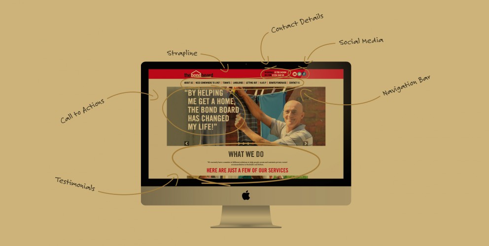
Here’s 5 things your website homepage should have in place to achieve this:
Tell the world who you are and what you’re about!
Unless you’re a globally renowned brand, a good website homepage should effectively communicate who you are and what you do, to encourage your audience to stay on your site and find out more. It’s thought that you need to engage them within the first 16 seconds to ensure you’ve captured their attention! If you are unsure about your key message and what your brand is trying to say, spend some time refining this first. Water Aid do this well, with punchy content that communicates their core objectives in an easy to digest way.
Great design and use of images
The best content and copy in the world can get overlooked if the design and use of images doesn’t engage people. A well crafted homepage will combine use of graphics, text and multimedia where necessary in a creative way, to ensure the main purpose of the page is communicated effectively. The Red Nose Day website makes primary use of images to speak directly to their target market - families.
Include CTA’s
An effective homepage will include both primary and secondary CTA’s (or call to action points). The aim of these is to direct the user to take the next logical step - for example ‘read more here’ (secondary call to action), or DONATE NOW (primary call to action). As the aim of the homepage is to encourage users to dig deeper a strong call to action helps guide them in the direction you want to take them. As a large part of site traffic goes to the homepage you want to ‘convert’ as much of it as possible! The WWF are great at this with a bold ‘join, donate, support’ button in the top navigation and a ‘help protect Selous game reserve’ button further down.
Highlight your benefits!
As we said at the start, it’s critical to explain who you are and what you do but it’s equally as important to tell your users how that’s of benefit to them. Any company will be keen to use their homepage to promote their key USP’s. It’s slightly different for charities but you will still want to tell them about your cause and focus how their support can really make a difference. Save the Children do this well by featuring current issues such as the plight of child refugees and linking out to pages on how your money is actively helping to save lives. They also have a sidebar with a clear list of ways people can get involved.
Show some...humanity!
Far from being some faceless corporate brand which struggles to communicate a more human angle, your charity will naturally convey a more personal approach. You consist of a team of people passionate about what the charity does and keen to make the world a better place. Cancer Research do this brilliantly by featuring stories that resonate, such as a Mother beating cancer and being able to attend her daughter’s wedding.
OFFER EXTENDED: Sign up before the end of April and get 3 months FREE hosting worth £270
Landing page/
£949 (Usually £1,200)
Struggling without a web presence? We'll create a stunning landing page for you complete with details about your business, social media links and an attractive enquiry form for potential customers to contact you.
Further £100 off when purchased with another of our packs
Email hello@22group.co.uk - Offer only available until the end of April.
The team at 22 Group are exhibiting at the Northern Business Expo on 14th and 15th April. The renowned business exhibition, which is free to the general public, provides business owners with the opportunity to forge valuable relationships with potential customers and suppliers, gain solid business advice from over 150 exhibitors as well as the chance to take part in free seminars and skills packed workshops. Two of those will feature 22 Group members this year in the Digital Marketing hub. The Expo has always attracted leading speakers and thought-leaders, this year featuring supermodel Caprice talking about how she built up her global enterprise.
Our award-winning Creative Director, Robin Arnold is holding an ‘Introduction to Branding’ workshop at 10.30 each day, which explores how understanding the difference between branding, marketing, design and advertising can lead to business success. If online is more your forte, at 2.15 you can head over to hear from Marketing Manager, Amber Stevens at a fun social media workshop which will provide you with the basic skills and knowledge to get started online and advice on how to make your social media campaigns an ongoing success.
If you fancy a break from developing new skills and knowledge, pop over to stand A22 to meet the rest of the team and get your selfie snapped for a chance to win a luxury 2-night stay in the prestigious Mayfair hotel, 9 Hertford St, just moments away from Buckingham Palace.
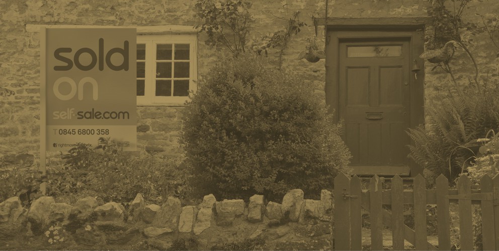
Self-Sale.com is a very smart idea that needed a very smart website. They are an online estate agency offering a complete service for 0.5% +VAT but 22 gave them 100% in refreshing and refining their unique estate agency website.
We've had a very successful partnership since 2007 when 22 created their brand identity and we've been constantly helping them build their brand ever since. Our new look includes more emphasis in providing valuable property advice to their clients.
Steve Butt, a partner in Self-Sale.com comments: "I can always rely on the guys at 22 to give me total commitment and the most eye-catching site in my market"
Robin Arnold, creative director of 22 says "we're always keen to work with innovative, customer focused companies like Self-Sale.com and we're equally delighted with the end result".
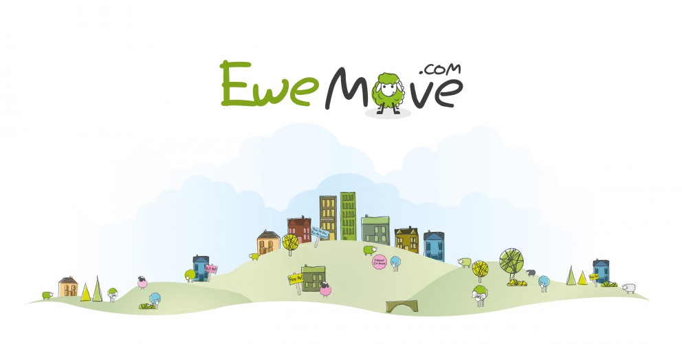
When the UK's most innovative property group needed a new website design they naturally first viewed then moved to 22. Having re-branded themselves as EweMove with a distinctive 'sheep' logo they wanted a website that was as cool and witty. We not only gave them a strongly branded fresh 'natural' look (miles away from the traditional, cluttered 'letting agent' style) but we also 'branded' the language. So, 'Ewe could could find a property that was best of breed', 'their service was ewe-nique' and 'they were the best property group - baa none' Robin Arnold, Creative Director of 22 says,"EweMove have been great partners in encouraging us to create a website that's as distinctive and innovative as they are and we're now repeating this style in their promotional literature. They've been baa-rilliant"(see it's catching)
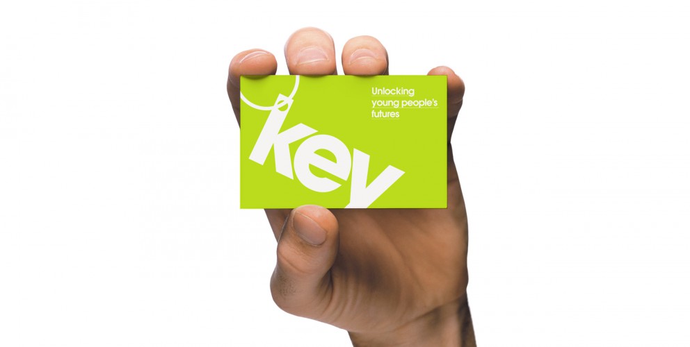
We are chuffed to bits to announce the launch of the Key youth charity branding and website! Thanks to the team for all of their hard work and thanks to Key for being such a cool client.
We were asked to reinvigorate and refresh the look and feel for the youth charity Key. Their tired brand identity and website didn’t fully represent them as a charity aimed at young people.
Key is an amazing charity that provides housing support to young people up to the age of 25. Offering a variety of services including mediation, support, mentoring and counselling, it was imperative that their target audience could instantly connect with the brand; moreover to actively encourage them to get in touch and not immediately dismiss Key because of their outdated design.
Director of Key, Ursula Patten had a clear vision for the brand: “Key decided to update its identity as although our black and white Key was well designed and had been used for a long time, a number of young people had commented that it was boring and austere."
“We were looking for something to reflect that we are young person focused. We wanted something more colourful and more vibrant. We were delighted with the new logo - it was bright and simple - we felt that it wouldn’t date. This was the starting point for the redesign of the website. The old website was very static and one dimensional and again didn’t reflect Key’s ethos.”
Through clever use of typography we created a modern and engaging logo with subtle reference to the shape of a ‘Key’. The bright colour pallette, angular typography and photos of service users created a distinctive and memorable look that genuinely conveys Key’s message.
Key’s core requirements for the site were to appeal and convey vital information to young people who need help, and to also shout about the great work it is doing in order to fundraise and attract volunteers. These were also fulfilled by developing two clear routes through the site by using compelling graphic design.
Patten and the board of trustees were delighted with the end result and our collaborative approach: “We chose 22 as a number of our trustees had seen previous examples of their work. We were impressed by their professionalism. It helped that the staff put in the time to work with the board of trustees and took them through a number of design options and the thoughts behind them."
“The website design element felt like a two way process with Key’s thoughts and ideas fully incorporated. It is no easy task to build a website that will please all those involved, but 22 have been patient in ensuring that this happens. We are extremely pleased with the result. It doesn’t just look like any other website. It is bright and engaging.”
It was great to work with a charity that gives so much back to the youth community of today, it made this project so much more meaningful. It’s a privilege that our designs and strategic positioning of the brand will help young people to get the assistance that they need.
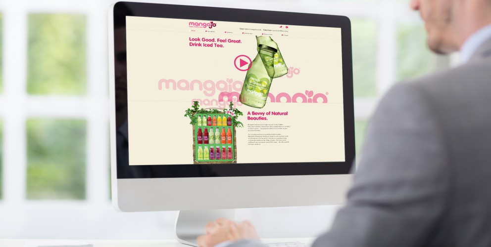
We’ve worked with this super fun and funky global brand for 3 years. In that time, we’ve worked on a number of projects, and most recently – was asked to redesign and redevelop their website.
MangaJo sell Healthy drinks in over a 20 countries, so the new website had to appeal to an ever growing user base. They wanted an uber cool, fun, and funky website that was informative, easy to use, and update.
We created a feel good website that looks and feels as fresh and funky as the MangaJo brand. We kept it minimal, utilising great product photography, cool illustrations and most of all made it fun. The site was built with a system that enabled the client to update any page, quickly and easily.
Needless to say, we were chuffed to bits with great feedback received so far, and the fantastic responses from the many visitors on the website.
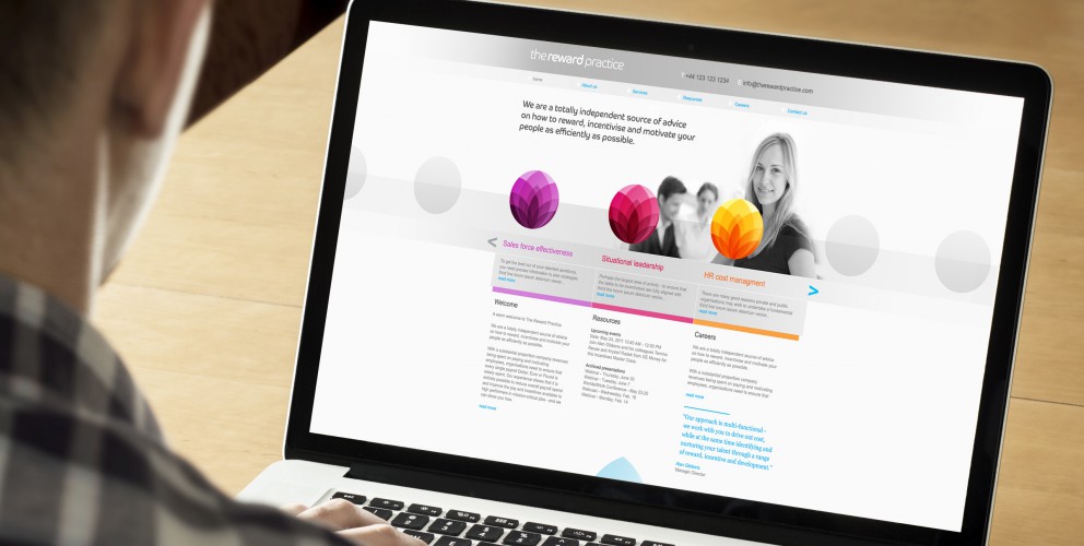
The Reward Practice are an independent source of advice on how to reward, incentivise and motivate staff. As part of our branding development for the Reward Practice we were asked to do a complete redesign and development of their existing website.
We started from scratch with this project. The existing site just wasn't doing it's job and the new site had to contain considerably more information. The task for us was how to keep the clean minimalist look and feel of the new branding we had created whilst containing such a large amount of resource material.
Good use of grids and structured typography normally does the trick in these situations and it was perfect for this project. What initially looks like a lot of text, doesn’t look and feel as heavy and crowded. Also, the site could be used for information on the specialist subject of rewards and incentives. This has naturally attracted a more traffic to the site.
Overall, the new site has helped The Reward Practice reach out to a much larger audience and has helped them sell their product more effectively.
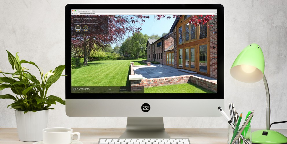
We are chuffed to bits to announce the launch of the Nomadic Properties website.
They asked us to create a website that was not only modern, easy to use and easy to update, but would also showcase the great work they’ve been doing, from stylish country retreats to elegant period conversions.
We created a simple but sophisticated website that was easy to use and easy to update, we also decided to let their beautiful work do most of the talking, showcasing their images to the best of their abilities.
We looked at how they put style, craftsmanship, technical ability and planning into their buildings and used it as inspiration for their website.
This resulted in, easy to use but highly structured layout grids, stylish graphic silhouettes and well-thought-out site plans.
Finally, the site was built with a system that enabled the client to update any page of their website, anytime at their leisure.
22 Group is the umbrella company for creative work. Check out our specialised branches for work in the property and finance sectors: Property Stream |Finance Stream