10/01/2013

Superlogos

Over the next few months we are going to be listing our top 10 favourite logos of all time.

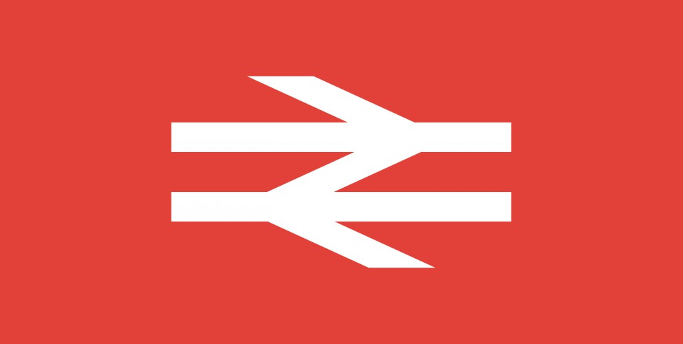
We are starting with an absolute corker, the one and only British Rail logo. OK, this maybe not be the sexiest marque you have ever seen but it has the stats of an absolute Top Trump.

When it comes to longevity it gives Cliff Richard a run for his money. It just keeps on going and going...in fact the logo, first commissioned in 1965, is still being used in 2013! Long after the demise of British Rail the marque is now used on traffic signs throughout the United Kingdom.

"In 1964 the Design Research Unit—Britain's first multi-disciplinary design agency founded in 1943 by Misha Black, Milner Gray and Herbert Read—was commissioned to breathe new life into the nation's neglected railway industry, the corporate image of which had remained largely unchanged after its nationalisation in 1948, a reflection of a largely disjointed and out-of-date transport system. The company name was shortened to British Rail and Gerry Barney of the Design Rearch Unit conceived the famous 'double-arrow which represents two tracks, heading in different directions, and crossed by stylised points." - Nick Jobs

There certainly aren't many logos out there that have lasted longer than the company they were originally created for! Here are some great articles about the history and application of this branding gemstone.

http://www.doublearrow.co.uk/

http://www.guardian.co.uk/artanddesign/artblog/2006/dec/12/everydesignthebritishrail

19/12/2012

Flying retro

As some of you may or may not already know we have a bit of penchant for retro design. The standard of typography, and photography on some of our favourite 60's / 70's poster designs is in a class of its own. Their purest simplicity makes them timeless masterpieces that look contemporary 40 years after they were crafted.

Whether or not you are fan of Swiss typography and well structured grids, you can't deny this is why the posters look so fresh and modern in 2012.

Some of our favourites include Ivan Chermayeff’s beautiful but uncompromising, Modernist Pan Am Airlines adverts. Here is a great article about the story behind them. http://bit.ly/Tyk5tt

And the incredible design legacy left behind by Otl Aicher's identity system, iconic posters and highly influential imagery for the 1972 Munich Olympics. http://bit.ly/U8fr6w  http://bit.ly/Tyk5tt

I only wish the legacy had reached a little further and touched the orchestrators of the London 2012 Olympic identity. But don't get me started me started on that! That's another story... if only Otl had been on the case in 2012!

And last but certainly not least, the master of all grids, Josef Müller-Brockmann http://bit.ly/V6v4ML

He is perhaps the most well-known Swiss designer and his name is probably the most easily recognized when talking about the period. His incredible obsession with grid systems goes to the point where he includes in his book aptly named the 'Grid System' a grid layout for arranging furniture within a room. http://bit.ly/Tyq4OU

Mr Muller, we will definitely keep this grid in mind for the new 22HQ layout!

21/11/2012

Mangajo packaging design

22 have been working with healthy drinks brand Mangajo on the packaging for their new 330ml range of drinks. We have designed the labels for the Lemon and Green Tea, Red Grape & Rooibos, and Pomegranate & Green Tea bottles.

Using the lovely brand petal as a device to contain the details and introducing a fresh new colour scheme, we have created a look and feel that is as fresh fruity as the drinks – and the Mangajo brand for that matter.

Mangajo have many UK independent stockists and are sold in well known stores such as
www.waitrose.co.uk
www.wholefoods.com
www.yosushi.com
www.flatplanet.co.uk
www.Harrods.com
www.selfridges.co.uk
www.budgens.co.uk
as well as over 20 countries around the world. Whether you are in Manchester or Malta, Greece or Guadeloupe look out for this bevvy of natural beauties on a shelf near you!

16/07/2012

Global Filmmakers pitch win

We've just been told we have won the three way creative pitch we took part in at the beginning of the month. The pitch was for the branding and website design and development of Global Filmmakers. One of the most comprehensive, efficient and most advanced video production packages available in the UK.

We cant wait to get started. Action!

22/05/2012

Manchester Digital Skills summit identity

The Manchester Digital Skills summit is a source of valuable information and guidance for anyone who needs access to digital talent and it’s the opportunity for the digital community to shape skills development across the region and keep the next generation of digital talent in Manchester.

We were asked to create a logo for the event and happily obliged with this cool typographic marque which includes the Manchester Digital logo.

This is a great event and we thoroughly recommend if your into digital, and live in the North West, you get yourself to the event.

Hopefully see you there.

13/05/2012

The Reward Practice brand identity

We are proud to announce the official launch of The The Reward Practice brand identity.

The Reward Practice are a totally independent source of advice on how to reward, incentivise and motivate staff as efficiently as possible. They asked us to make their brand appeal to their customer base (FTSE 100 organisations), feel professional, corporate and stand out from their competitors.

With a substantial proportion company revenues being spent on paying and motivating employees, organisations need to ensure that every single payroll Dollar, Euro or Pound is wisely spent.

The experience of our friends at The Reward Practice shows that it is entirely possible to reduce overall payroll spend and improve the pay and incentives available to high performers in mission-critical jobs.

The saying ‘Earning the Fruits of your labour’ inspired the branding concept. The feel we got from this was Rewarding, Hard work and Organic. With these words in mind we created eye-catching graphics – inspired by fruit, contemporary typography and a brand that looked confident, corporate but fresh and different enough to stand out of the crowd.

23/04/2012

Online estate agency advertising campaign

Here is the first glimpse of the new advertising campaign we have created for online estate agency Self-sale.com. The look and feel of the campaign uses the graphic illustrations we created back in February as part of the brand refresh.

This is the first bill board advert to be designed and we are over the moon with the positive feedback we have received so far.

04/04/2012

Manchester Digital roster badge

Manchester Digital recently asked 22 to design a badge for their roster.

The Roster acts as a recommended supplier list for customers looking for trusted suppliers from a wide range of disciplines including creative, marketing and media, through to technical, software and ICT.

Successful applicants will be awarded a Roster Badge which can be carried on their website and stationary as a way of telling potential customers that they are a quality supplier in a named discipline.

In keeping with the Manchester Digital brand identity we created a minimalist badge that uses digital source code as the theme.

28/02/2012

Self-sale.com brand refresh

We have been working with Self-sale.com for over 4 years. They are one of the North Wests first and most successful online estate agents. By putting their resources into marketing property online they save money not having to pay for expensive shop fronts. They pass this saving onto home sellers and offer incredibly low rates. Cut a long story short they save home sellers thousands in agency fees. There are definitely onto a good thing!

We created the Self-sale.com brand identity in 2008. It has served them well but needed a bit of spring clean. We feel keeping a brand looking fresh once it has been launched is a really important way to keep customer interest.

With this in mind we have commissioned new photography, and some eye catching and graphic illustrations that will be perfect for the advertising and marketing campaign that will be rolled out over the next few months.

29/12/2011

NHS Tameside and Glossop Annual report

22 have recently finished the design and production of the latest Public Health Report for Tameside and Glossop.

This years Public Health Annual Report focuses on 5 health priorities which were the health issues for the local population:

  • Tackling health inequalities and life expectancy
  • Deducing premature death from cardiovascular disease (which includes conditions such as heart attacks and strokes)
  • Reducing harm from alcohol
  • Improving mental health and well-being and a healthy start in life

We came up with the title and theme for the document "Give me 5' The number theme is used as a devise throughout the 48 page document.

The report has been designed to be readable for an informed lay reader as well as professionals who are interested in the health of people in Tameside and contains some fantastic reportage photography of local care workers and patients.

20/10/2011

NHS GP and dental access campaign

We have been working with Tameside & Glossop NHS on a GP and Dental Access Campaign. The campaign aims to create greater awareness of the good level of access to GPs and dentists in the borough. Contrary to popular belief you still can get access to dental care on the NHS. I know... we were quite surprised as well!

We have used fun and funky animal illustrations by the extremely talented Louise Arnold. Our favourite illustration is the croc having a filling done by a very brave dentist!

From past experience illustration works particularly well in campaigns such as this. Especially if the illustrations use humour to convey a serious message. If you can make people smile you've usually got their attention.

Its always amazing to see your work on large format billboards and its been great to receive such positive feedback so earlier in the campaign.

Manchester

0333 242 0647
enquiries@22group.co.uk

26 Dale Street, Manchester, M1 1FY
Find us on Google Maps

Our partners

22 Group is the umbrella company for creative work.

Check out our specialised branches for work in the property and finance sectors: Property Stream | Finance Stream

22 Group is a proud member of The Pride, an alliance of independent creative and communications companies.

Copyright © 22 Group Ltd. 2020. All rights reserved.