We know charities are taking their web presence more seriously now, with more investment in going responsive and mobile friendly, more focus on engaging the right audiences and more charities ensuring their website have eye-catching call to actions. For any business or organisation, a website is often the first contact someone has with your brand. Your homepage is effectively your shop window, it’s the first impression you make before the user decides to delve further...and as the saying goes “you don’t get a second chance to make a first impression”.
With this in mind, the aim of your website’s homepage is to engage your users further, driving them through the site to engage and identify with your brand, take the required actions and remember you!
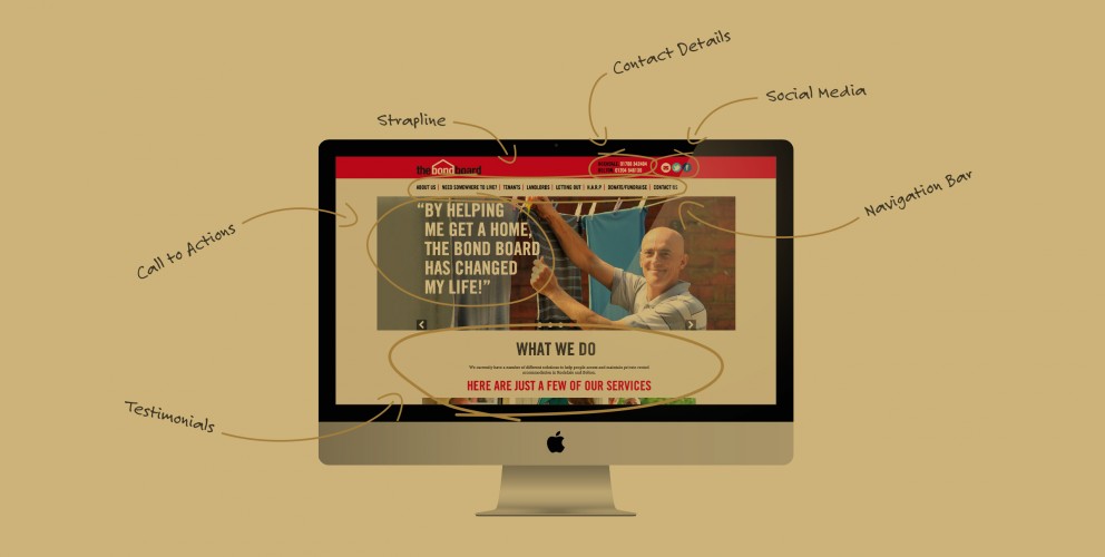
Here’s 5 things your website homepage should have in place to achieve this:
- Tell the world who you are and what you’re about!
Unless you’re a globally renowned brand, a good website homepage should effectively communicate who you are and what you do, to encourage your audience to stay on your site and find out more. It’s thought that you need to engage them within the first 16 seconds to ensure you’ve captured their attention! If you are unsure about your key message and what your brand is trying to say, spend some time refining this first. Water Aid do this well, with punchy content that communicates their core objectives in an easy to digest way.
- Great design and use of images
The best content and copy in the world can get overlooked if the design and use of images doesn’t engage people. A well crafted homepage will combine use of graphics, text and multimedia where necessary in a creative way, to ensure the main purpose of the page is communicated effectively. The Red Nose Day website makes primary use of images to speak directly to their target market - families.
- Include CTA’s
An effective homepage will include both primary and secondary CTA’s (or call to action points). The aim of these is to direct the user to take the next logical step - for example ‘read more here’ (secondary call to action), or DONATE NOW (primary call to action). As the aim of the homepage is to encourage users to dig deeper a strong call to action helps guide them in the direction you want to take them. As a large part of site traffic goes to the homepage you want to ‘convert’ as much of it as possible! The WWF are great at this with a bold ‘join, donate, support’ button in the top navigation and a ‘help protect Selous game reserve’ button further down.
- Highlight your benefits!
As we said at the start, it’s critical to explain who you are and what you do but it’s equally as important to tell your users how that’s of benefit to them. Any company will be keen to use their homepage to promote their key USP’s. It’s slightly different for charities but you will still want to tell them about your cause and focus how their support can really make a difference. Save the Children do this well by featuring current issues such as the plight of child refugees and linking out to pages on how your money is actively helping to save lives. They also have a sidebar with a clear list of ways people can get involved.
- Show some...humanity!
Far from being some faceless corporate brand which struggles to communicate a more human angle, your charity will naturally convey a more personal approach. You consist of a team of people passionate about what the charity does and keen to make the world a better place. Cancer Research do this brilliantly by featuring stories that resonate, such as a Mother beating cancer and being able to attend her daughter’s wedding.